

The British Invasion
For our final project in the Information Visualization class at UC Berkeley, a colleague and I designed and created an interactive visualization that shows The Beatles’ success in the UK and the US.
Our visualization was inspired by a project named “Charting the Beatles“, led by a graphic artist named Michael Deal. He has created several information visualizations about the Beatles, including depictions of lyrical structure, chords, and song authorship contributions. The project had grown via a public Flickr pool of contributions. Some of the original visualizations were very compelling, and because both of the group members of this project were lifelong Beatles fans, we decided to create a visualization to contribute to the project.
We had noted in the discussion of the Charting the Beatles project that most of the visualizations were static, and that people wanted to see interactive visualizations.
Concept
Based on our research, we discussed a number of ideas during our brainstorming process. We considered doing a timeline of geographic details about where the Beatles were, or concerts they performed. We also thought about compiling chord data and showing changes in the complexity and simplicity of the Beatles song structure.
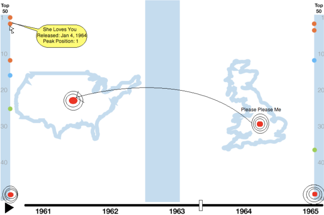
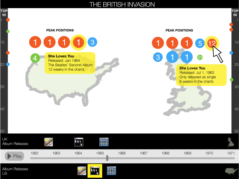
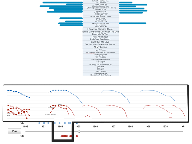
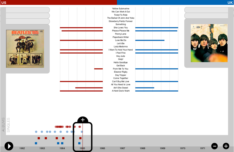
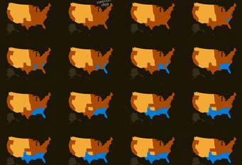
We finally decided to take the record chart positions from international locations and map them over time. While talking about this idea, we struck on the concept of the British Invasion, a well-known phenomenon where British rock artists surged in popularity during the mid-60s. We thought this was an intriguing idea because it allowed us to form hypotheses like:
- The Beatles were popular in the UK only, until they became known in America and quickly became popular there.
- Certain songs, like “I Want to Hold Your Hand”, had the most immediate popularity in the US
- The British Invasion started in 1964 and ended in 1967.
- The US market got flooded with Beatles Singles after they made the step across the Atlantic.