


Green Button Energy Report
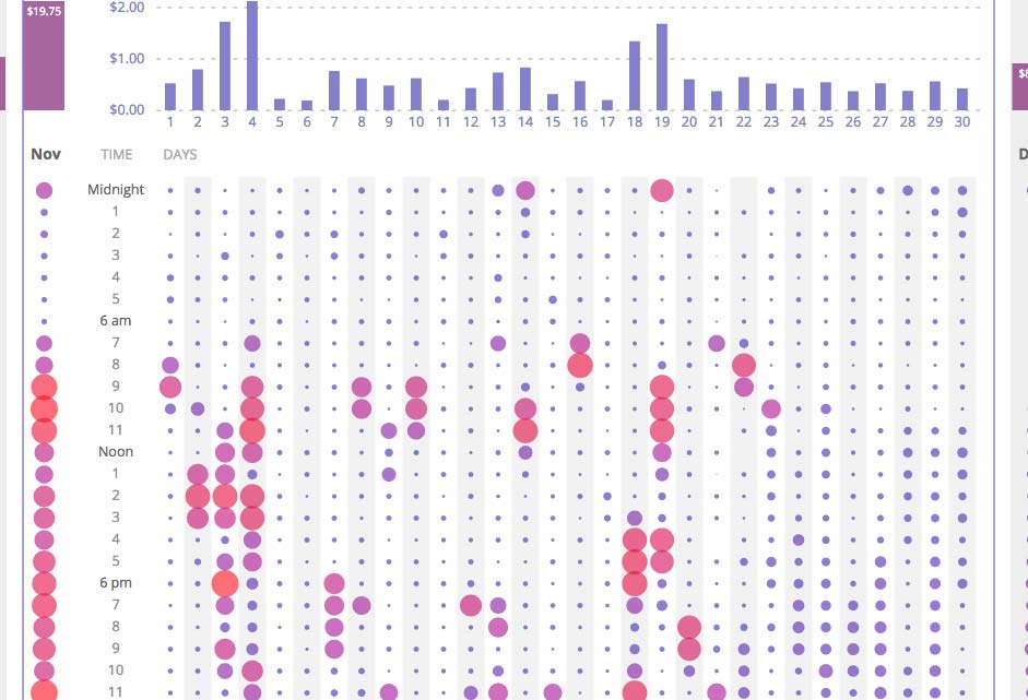
Every month each household gets a bill from their utility provider charging them for the energy used in the previous month. We pay our utility bills in dollars, for usage that is measured in kWh. kilo-watt-hours: the number of hours times our energy usage in thousand watts. If that sounds abstract it’s because it is. kWh is an arbitrary unit. Utility companies are of course aware of that and try to provide some additional information with each bill, usually showing the current usage compared with past months. That’s not particularly insightful, because we do a bunch of different things throughout one month. We keep our lights on when it’s dark, longer in the winter, and shorter in the summer months. We blow dry our hair every morning between 7:45 and 8AM, but only on weekdays. We have that space heater that keeps the room warm when the central heating is not enough. Not to speak of that old fridge that uses so much more energy than we would expect. Everyone’s energy usage is different, and what we pay for is mentally far removed from the actual usage.
It doesn’t have to be that way. Dozens of utility companies across the country agreed on a common standardized data format that provides detailed information to their customers. This data format is dubbed “Green Button Data”. That’s a great first step. As visualizers we couldn’t just sit idly by with a data set like this one. We designed and developed an app that allows PG&E customers to see and explore their energy usage over the course of a year.
Based on my own Green Button Data, I developed the concepts, initial prototype, and developed the app. You can find it at http://halftone.co/projects/energy-report.
Collaborator: Paul Van Slembrouck